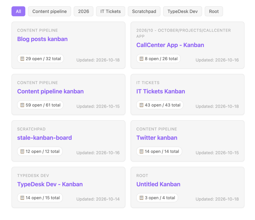
This tutorial breaks down the interactive DataviewJS script step-by-step. Instead of walking through abstract code top-to-bottom, we use the visible elements on your screen as our guiding star:
┌─────────────────────────────────────────────────────────────┐│ [ All ] [ Content pipeline ] [ IT Tickets ] [ Projects ] │ ← 1. Filter Bar├──────────────────────────────┬──────────────────────────────┤│ CONTENT PIPELINE │ IT TICKETS ││ Twitter kanban │ IT Tickets Kanban │ ← 2. Card Header│ │ ││ 📋 3 open / 8 total 2026-10│ 📋 14 open / 42 total 2026-10│ ← 3. Card Footer├──────────────────────────────┼──────────────────────────────┤│ PROJECTS │ ROOT ││ CallCenter App - Kanban │ Untitled Kanban ││ 📋 1 open / 5 total 2026-10│ 📋 0 open / 3 total 2026-10│└──────────────────────────────┴──────────────────────────────┘ ↑ 4. The 2-Column Responsive Grid
Point 1: The Root Canvas (this.container)
Every DataviewJS block executes within a DOM element provided by Obsidian’s markdown renderer.
const root = this.container;
- Why not
dv.container? The Dataview API object (dv) does not own the container DOM node. The execution context is bound tothis, which exposes Obsidian’s nativethis.containerelement. - Why it matters: Using
this.container.createDiv()attaches your grid directly to Obsidian’s note flow without creating phantom text nodes that break CSS grids.
Point 2: The Filter Bar ([ All ] [ IT Tickets ] [ ... ])
┌─────────────────────────────────────────────────────────────┐│ [ All ] [ Content pipeline ] [ IT Tickets ] [ Projects ] │└─────────────────────────────────────────────────────────────┘
The filter bar discovers your categories automatically from your vault’s folder structure, then creates buttons.
Step A: Querying the boards
const boards = Array.from( dv.pages() .where(p => p.file.frontmatter && p.file.frontmatter["kanban-plugin"] && p.file.path !== dv.current().file.path) .sort(p => p.file.name, "asc"));
p.file.frontmatter["kanban-plugin"]: Checks for the YAML frontmatter injected by the Kanban plugin.p.file.path !== dv.current().file.path: Self-exclusion guard so the dashboard note never lists itself.Array.from(...): Unwraps Dataview’s internalProxy(DataArray)into a native JavaScript array so string methods andSetwork reliably.
Step B: Deriving the Button Labels
const rawCategories = boards.map(b => { const folder = String(b.file.folder || "").trim(); if (!folder) return "Root"; return folder.split("/").shift().trim();});const categories = ["All", ...Array.from(new Set(rawCategories))];
.split("/").shift()grabs the top-level parent folder (e.g.Content pipeline/ArchivebecomesContent pipeline).new Set(...)strips out duplicates so you only get one button per folder.- Prepends
"All"to provide a reset button.
Step C: Constructing the Button Bar
const buttonBar = root.createDiv({ cls: "kanban-filter-bar", attr: { style: "display: flex; gap: 8px; flex-wrap: wrap; margin-bottom: 16px;" }});
Point 3: The 2-Column Grid Layout
┌──────────────────────────────┬──────────────────────────────┐│ Card 1 │ Card 2 │├──────────────────────────────┼──────────────────────────────┤│ Card 3 │ Card 4 │└──────────────────────────────┴──────────────────────────────┘
To display cards neatly in pairs, we use CSS Grid:
const grid = root.createDiv({ cls: "kanban-card-grid", attr: { style: "display: grid; grid-template-columns: repeat(2, 1fr); gap: 16px; margin: 1em 0;" }});
display: grid: Turns the container into a grid context.grid-template-columns: repeat(2, 1fr): Creates 2 equal-width responsive columns (1fr= 1 fractional unit).gap: 16px: Clean spacing between rows and columns without margin collapses.
Point 4: The Card Header (Folder Badge & Board Link)
┌──────────────────────────────┐│ CONTENT PIPELINE │ ← Category badge│ Twitter kanban │ ← Clickable board link│ │
For every board, we construct a card wrapper and attach the header:
const card = grid.createDiv({ cls: "kanban-card-item", attr: { style: ` background-color: var(--background-secondary); border: 1px solid var(--background-modifier-border); border-radius: 8px; padding: 16px; display: flex; flex-direction: column; justify-content: space-between; min-height: 105px; box-shadow: 0 1px 3px rgba(0, 0, 0, 0.05); ` }});const top = card.createDiv();// Small category subtitletop.createDiv({ text: folder || "Root", attr: { style: "font-size: 0.75em; text-transform: uppercase; letter-spacing: 0.05em; color: var(--text-faint); margin-bottom: 4px;" }});// Clickable Title Linktop.createEl("a", { text: String(board.file.name), cls: "internal-link", href: board.file.path, attr: { style: "font-weight: 600; font-size: 1.1em; color: var(--text-accent); text-decoration: none; display: inline-block;" }});
- Obsidian CSS Variables: Uses
var(--background-secondary)andvar(--text-accent)so colors adapt seamlessly between light and dark themes. cls: "internal-link": Tells Obsidian to treat this element as a native link, preserving hover previews and click navigation.
Point 5: The Card Footer (Metrics Pill & Last Updated)
│ ││ 📋 3 open / 8 total 2026-10 │ ← Footer row└──────────────────────────────┘
The bottom of each card pulls live metrics directly from Dataview’s parsed task list:
const tasks = board.file.tasks ? Array.from(board.file.tasks) : [];const openCount = tasks.filter(t => !t.completed).length;const totalCount = tasks.length;const bottom = card.createDiv({ attr: { style: "display: flex; justify-content: space-between; align-items: flex-end; margin-top: 14px; font-size: 0.8em; color: var(--text-muted);" }});// Status pillbottom.createEl("span", { text: `📋 ${openCount} open / ${totalCount} total`, attr: { style: "background: var(--background-primary); padding: 3px 8px; border-radius: 12px; border: 1px solid var(--background-modifier-border);" }});// Date labelbottom.createEl("span", { text: `Updated: ${board.file.mtime.toFormat("yyyy-MM-dd")}`, attr: { style: "color: var(--text-faint);" }});
!t.completed: Filters for active cards (- [ ]) vs done cards (- [x]).display: flex; justify-content: space-between: Pins the task pill to the bottom-left and the timestamp to the bottom-right.
Point 6: The Wiring (Clicking to Filter)
Now we connect Point 2 (Buttons) to Point 4 & 5 (Cards).
// 1. Keep track of card elements and their categorycardItems.push({ el: card, category: category });// 2. Button styling helperfunction selectButton(selectedBtn) { buttons.forEach(btn => { const isActive = (btn === selectedBtn); btn.style.backgroundColor = isActive ? "var(--interactive-accent)" : "var(--background-secondary)"; btn.style.color = isActive ? "var(--text-on-accent)" : "var(--text-muted)"; btn.style.borderColor = isActive ? "var(--interactive-accent)" : "var(--background-modifier-border)"; });}// 3. Attach click event to each buttoncategories.forEach(cat => { const btn = buttonBar.createEl("button", { text: cat, attr: { style: "cursor: pointer; padding: 5px 12px; font-size: 0.85em; border-radius: 6px; border: 1px solid var(--background-modifier-border); background-color: var(--background-secondary); color: var(--text-muted); transition: all 0.15s ease;" } }); btn.onclick = () => { selectButton(btn); // Hide or show cards instantly cardItems.forEach(item => { const match = (cat === "All" || item.category === cat); // "" clears display:none and restores the CSS Grid flow item.el.style.display = match ? "" : "none"; }); }; buttons.push(btn);});// 4. Activate the first ("All") button on initial renderif (buttons.length > 0) { selectButton(buttons.at(0));}
Why display = match ? "" : "none"?
In CSS Grid layouts, setting an element’s display to flex or block overrides its grid item positioning. Setting it to ""removes the inline display property entirely, letting the browser restore its natural grid flow without layout glitches.
Summary Checklist
| Visual Element | Code Mechanism | Key Benefit |
|---|---|---|
| Filter Buttons | Set(categories) + buttonBar.createEl("button") | Dynamic, auto-adjusts when new folders are added |
| Active Highlight | var(--interactive-accent) | Follows current Obsidian theme colors |
| 2×2 Grid | display: grid; grid-template-columns: repeat(2, 1fr) | Clean alignment and spacing |
| Card Link | createEl("a", { cls: "internal-link" }) | Native link behavior & file preview |
| Card Counts | tasks.filter(t => !t.completed).length | Live inspection of board backlog |
| Filtering Action | el.style.display = match ? "" : "none" | Client-side instant filter without re-queries |


Leave a Reply